Drupal 6: Configuring a mobile Drupal site and making your theme mobile friendly
In this tutorial I’ll explain how to setup your Drupal site to be mobile friendly. Before you begin, it’s helpful to consider the following: 1) which mobile devices to support; 2) using a different theme for mobile; 3) which hostnames will be used; 4) multi-site configuration options; and 5) any site alterations to simplify the mobile experience.
For my site I decided on the following:
- iPhones (to start)
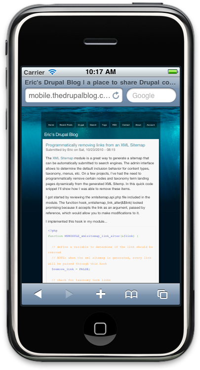
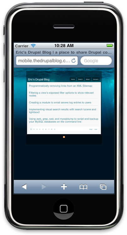
- Use a more clean theme for my mobile site: DevSeed’s Singular
- redirect mobile traffic to a new subdomain (mobile.ericlondon.com)
- I was using sites/default for my blog, so hosting another hostname on the same filesystem was not an issue
- I decided to remove some items in my primary navigation, and add some jQuery (accordion effect) to collapse node content on my front page.
I added the new DNS for my subdomain to point to the same IP address of my main site. In a standard Apache vhosts configuration, you can add a ServerAlias directive to ensure the mobile hostname is handled by the main site’s vhost. For example:
<VirtualHost *:80>
  ServerName ericlondon.com
  ServerAlias mobile.ericlondon.com
  DocumentRoot /var/www/vhosts/ericlondon.com/httpdocs
</VirtualHost>
I installed and enabled the Singular theme in sites/all/theme/singular.
I added some mobile specific configurations in my settings.php file (sites/default/settings.php):
<?php

/**
 * Mobile Theme Configuration
 */

// define mobile http host
define('MOBILE_HTTP_HOST', 'mobile.ericlondon.com');

// define mobile theme
define('MOBILE_THEME','singular');

// override custom theme for mobile site
if ($_SERVER['HTTP_HOST'] == MOBILE_HTTP_HOST) {
  $GLOBALS['custom_theme'] = MOBILE_THEME;
}

// check for iPhone
$is_iphone = preg_match('/iphone/i', $_SERVER['HTTP_USER_AGENT']);

// redirect to mobile theme
if ($is_iphone && $_SERVER['HTTP_HOST']!=MOBILE_HTTP_HOST) {
  header('Location: http://' . MOBILE_HTTP_HOST . $_SERVER['REQUEST_URI']);
  die;
}

?>
Now if someone visits my site using an iPhone, the user would be redirected to my specified mobile address, AND a new mobile theme would be used!
In addition I decided to make some alterations to my mobile theme to simplify the interface. I created a module and added a hook_preprocess_page() implementation:
<?php
function MYMODULE_preprocess_page(&$vars) {

  // only process page variables if this is the mobile address
  if ($_SERVER['HTTP_HOST'] != MOBILE_HTTP_HOST) {
    return;
  }

  // define mobile javascript
  /*
  NOTE: this jQuery is very specific to my theme, and is just shown as an example.
  I looked into using jquery_ui's accordion library, but it would not work out of the box with the structure of my new mobile theme :(
  In an ideal situation, all jQuery would be put in separate include files
  */
  $js = "

    // define node container
    var node_container = '.front #page #content';

    // define function to collapse node content
    function collapse_nodes() {
      $(node_container + ' .node div').hide();
    }

    // define function to add click event
    function node_title_add_click() {
      $(node_container + ' .node h2.node-title a').click(function(){
        collapse_nodes();
        $('div', $(this).parent().parent()).show();
        return false;
      });
    }

    $(document).ready(function(){

      collapse_nodes();
      node_title_add_click();

    });
  ";
  drupal_add_js($js, 'inline');

  // rebuild scripts variable
  $vars['scripts'] = drupal_get_js();

  // determine a list of hrefs to remove from primary navigation
  $href_remove = array(
    'drupal',
    'tagadelic/chunk/1',
    'recent-posts',
    'rss.xml',
    'logout',
    'contact',
  );

  // loop through primary links and remove as necessary
  if (is_array($vars['primary_links'])) {
    foreach ($vars['primary_links'] as $key => $value) {
      if (in_array(strtolower($value['href']), $href_remove)) {
        unset($vars['primary_links'][$key]);
      }
    }
  }

}
?>
By added the above module code and jQuery, I removed some items from my primary navigation and added an accordion-like interface for the front page:
NOTE: If you’re using a Mac, the iPhone Simulator application (which comes with Xcode + iPhone SDK) is a great way to development and test mobile configurations.