Drupal 6: Suckerfish CSS Drop Down Menus in Drupal Made Simple
In this article I’ll explain how to implement drop down menus in the easiest way possible. Before I begin, please checkout the original “suckerfish” dropdown tutorials like: A List Apart and Son of Suckerfish Dropdowns. Unfortunately, most CSS drop down tutorials still require you to add javascript to resolve IE6 issues. CSS menus require the “:hover” attribute on LIs, and IE6 just can’t handle it. I figured since Drupal already includes jQuery, I’d write a tutorial that takes advantage of jQuery’s simplicity and keeping the CSS to a minimum for ease of maintenance.
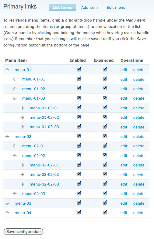
The first thing I did was create my menu structure. For this tutorial to work, you’ll need to ensure all the menu items are set to expanded (which makes sure they are all rendered when the menu is sent to the theme layer).
For purposes of this tutorial, I create a very blank theme (I started off use Garland, but I wanted to keep the CSS generic). I assigned the menu block (primary links) to a region on my page:
Next, I added the following CSS. As you can see, I’m using the unique identifier on the primary link block in this example. Check out the CSS comments to better understand what each line of CSS does. This CSS works with any number of child menus. NOTE: If you wanted your menus to scale with the font size, you could replace all the measurements with “ems”.
/* remove any previously set margins and paddings */
#block-menu-primary-links * { margin: 0; padding: 0; }
/* set width/height on <li>, <a>, <li><ul> */
#block-menu-primary-links li ul,
#block-menu-primary-links li,
#block-menu-primary-links a { width: 125px; height: 25px; }
/* remove <li> list styling off */
#block-menu-primary-links li { list-style: none; }
/* display <a> as block */
#block-menu-primary-links a { display: block; }
/* set <li> position */
#block-menu-primary-links li { float: left; position: relative; }
/* set position of <ul> in <li> */
#block-menu-primary-links li ul { top: 25px; left: 0px; position: absolute; }
/* position child <ul> */
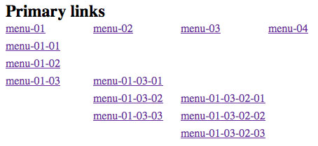
#block-menu-primary-links li ul ul { margin: -25px 0 0 125px; }For demonstration purposes, I left off one very import line of CSS to show the new layout of the menu structure. As you can see, the LIs are now positioned vertical their parent, and the child ULs are positioned off to the right. I wanted to show all the menu items in their desired layout to give you the opportunity to adjust the CSS (height, width, padding, etc).
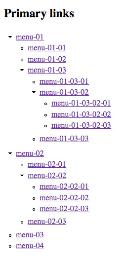
Now, you can add the last line of CSS which hides the display of all the child ULs:
/* set visibility of <ul> in <li> */
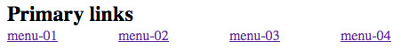
#block-menu-primary-links li ul { display: none; }The previous line of CSS will leave you with just the top level menu items:
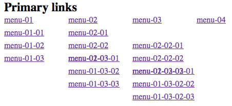
Lastly, I added a hover jQuery function to attach a javascript hide/show event on every LI:
$(document).ready(function(){
  $('#block-menu-primary-links li').hover(
    function(){
      $('ul:first', $(this)).show();
    },
    function(){
      $('ul', $(this)).hide();
    }
  );
});
Here’s an example of what the final result will look like. If you implement this code, and mouseover the menu structure, the child ULs will appear and disappear.